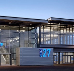
Batter up SoMa!
The area around AT&T Park has seen a phenomenal growth in the last few years, but clients (and huge baseball fans) in a circa 2004 building directly across from the field, were ready to update fixtures and finishes that were showing their wear and age. We gutted the master bath, refinished the kitchen cabinets, replaced the counters and gave everything a fresh, contemporary paint job that transformed the indistinguishable space. Now the couple can entertain friends and family in a home that’s worthy of the vibrancy of SOMA
Kitchen Trends?
Curbed.com asks “Which Kitchen Decor Trends Would You Do Away With?” What do you think?
Click the image to find out…
Tile!
Everyone knows I love tile – and for this kitchen project the clients chose a gorgeous quartzite for the counter. Now the hunt is on for the perfect complimentary tile and cabinet color. I narrowed down the the 154 Benjamin Moore whites to four and the tiles to two – and the deadline looms!
Landscape and Space
An outdated pool and landscape were what motivated clients in Los Gatos to call me, and the solutions weren’t so far off what I do for interior projects. The vast hardscape was broken down into a series of rooms and spaces, each with a different function: cooking, dining, relaxing, and play. To define those spaces, I created a pergola-covered living-area complete with an outdoor fireplace, a dramatic water feature built in to a retaining wall, and ample space for lounging and play.
The clients recently emailed and said “We love our new pool area and feel like our house has turned into one of those luxury spas.” I couldn’t agree more!
I’m Published!
This project I did for @BudgetBlinds won an award and was published in @IWCEVISION Magazine! @ArchDigest will be calling anytime… See the details of “Best Curtain and Drapery Design” on page 56 of Window Fashion Vision magazine.
Material Selection
Encaustic tiles with a Mediterranean influence from @Veranda_Tile are inspiration for my clients 1940s era kitchen remodel. Now the decisions are about the cabinets (light or dark) and the counters – and the possibilities are of course endless – but I’ve narrowed it down to give the clients some direction. Each of the lighter counter samples have degrees of texture and movement; while the dark sample picks up the greenish-grey of the tile and provides elegance without being stuffy.
I always love the point in the design process when we move from figuring out the space to selecting the finish materials and I can’t wait to see what they think!


