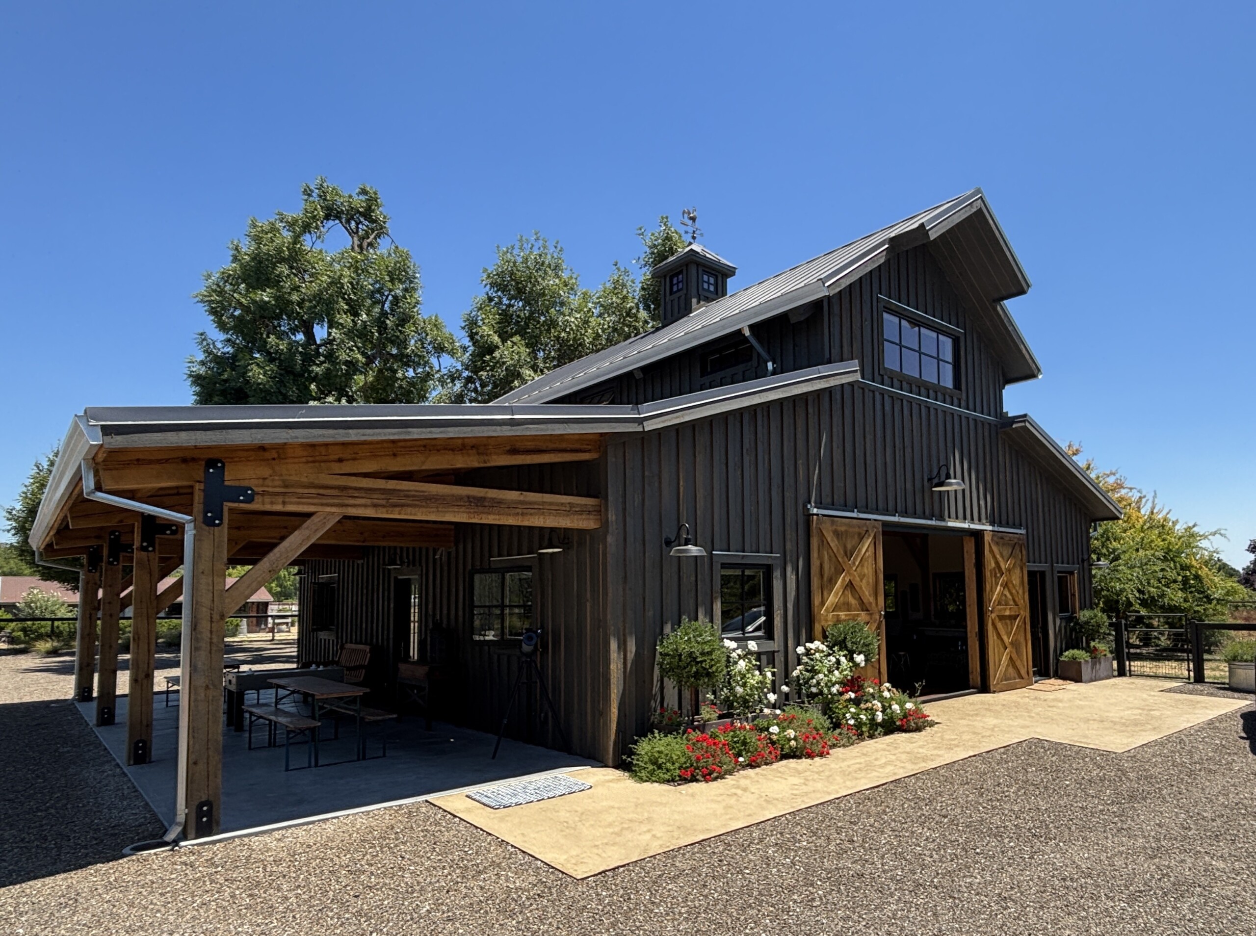
My client approached me to talk about a gorgeous property in rural California wine country. In addition to a farmhouse-style primary residence, the estate boasted acres of land nestled with olive groves, vineyards, farm animals, and pools. She envisioned renovating an existing structure to serve as the base for future family weddings and a haven [...]
Glamor in Noe Valley
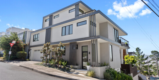
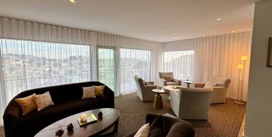
Kraig Meyer2025-02-10T16:14:49-08:00While the earliest developers built working class homes in Noe Valley for first generation immigrants, starting in the 1970's professionals flocked there due to its gorgeous views and proximity to both San Francisco and the peninsula. This hillside house was ready to expand from modest roots into a luxury home for a recently retired homeowner. [...]
Post-Postmodern
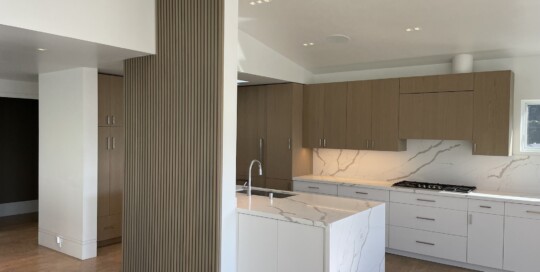
Kraig Meyer2024-02-08T16:50:05-08:00This property started its life in the early 1960s as did most homes in Midtown Terrace: a two story living space inspired by the Midcentury Modern movement with simplicity and clean lines. The 1980s brought a remodel that layered on a Post-Modern aesthetic, with curving walls, contrasting shapes, and bold colors highlighting classical architectural forms. The clients wanted to modernize the living space while downplaying the post-modern elements. The challenge? How to bring the home up to the standards of the present day without the cost of extensive exterior construction. The interior spaces of the house received a contemporary makeover. A beautiful architectural feature wall, grounded in a playful 1950s sensibility, provides separation between the kitchen and living room while maintaining an open floorplan. Skylights and windows were maintained and expanded, forging a connection between the interior and exterior spaces. A muted color palate downplays the curving front wall of the primary suite while decorative columns and tray ceiling from the Po-Mo remodel were removed. The bathrooms were completely rebuilt resulting in a contemporary yet timeless aesthetic.
Narrow, Hilly and New Revisited
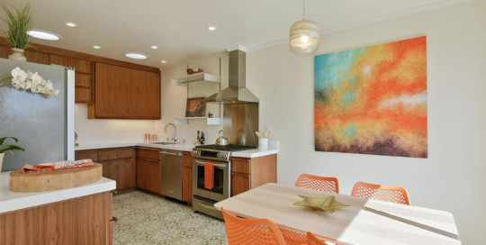
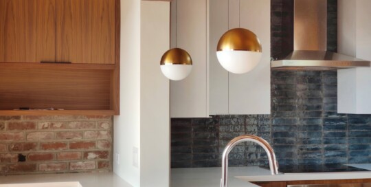
Kraig Meyer2024-02-08T16:50:10-08:00Noted architect Jonathan Bulkley originally designed this midcentury modern home to bring in as much daylight as possible. The barrel vault roof and arched windows in the living room showcase the home’s unique design and are a feature typical of Bulkley’s work. Located on an extraordinarily steep lot, the building is a perfect case study of the mid-mod movement’s focus of bringing the outdoors in with views over San Francisco. The clients were ready to update the home and placed great importance on retaining the feel of the original architecture while ensuring they had all the modern amenities. In the kitchen, walnut cabinets were paired with sleek white laminate uppers, riffing on the midcentury modern aesthetic. Hand-glazed tiles in the backsplash were inspired by the adjacent exposed brick. The bathrooms were completely reconfigured with colorful tile that adds a pop of excitement in keeping with the playful spirit of the era. The custom blend in the primary bath is washed in natural light from a new skylight overhead. The remodel successfully maintains the original vision of the home while infusing it with updated touches that made it feel fresh and contemporary.
Sonoma Ranch Update
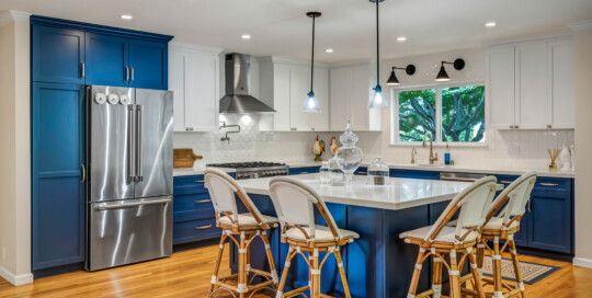
admin2024-02-08T16:49:16-08:00An outdated ranch-style home on the east side of Sonoma had a kitchen that was dark, cramped, and cut off from the rest of the house. My clients wanted to open up the walls and have a kitchen fit for entertaining friends and — even more importantly — their grandsons who live nearby. The melamine cabinets from the 80s were the first thing to go so the walls between the kitchen, dining room and living room could be opened up to their full widths. The bright blue and white color palette, a subtle trellis relief pattern on the backsplash tile, and timeless cabinet hardware and lighting tie the space together, that is now an integral part of the living area. In addition, an awkward transition from the living area, garage, and rear yard and pool was reconfigured, providing not only better light and flow, but a new powder room and laundry too. My clients are very happy now to have their grandsons over as much as they want.
The 1950s Modernized
admin2024-06-26T10:41:57-07:00I completely reimagined this 1950s-era property in Glen Park in a down-to-the-studs remodel; Custom finishes with one-of-kind designs and subtle nods to the home’s mid-century roots are throughout. The main level is a contemporary, open floor plan with kitchen, dining, living and an intimate library seating area center. A dramatic modern stair leads to the upper-level primary bedroom. This special property deserved a wow factor, and I was thrilled that the clients were willing to pull-out the stops for dramatic tile in the guest bath. The primary bath features a custom waterjet cut tile design on the floor that adds interest without overwhelming. There are custom cabinetry pieces throughout such as the family room cabinetry with storage and display space and clever sliding slats that reveal the television. I’m so excited to share the final product!
Vista del Mar Renovation
Kraig Meyer2024-02-08T16:48:24-08:00In the Outer Richmond, new homeowners had a charming home blocks from the ocean, but with all the original 1942 finishes in place. They had a clear vision for the aesthetic they wanted, and with some minor tweaks to the layout and custom built cabinets, the strategic placement of Vitsœ “606 Universal Shelving System” units, and solar-tube skylights to bring in more light at the back of the kitchen the transformation was complete. In the bathroom we removed the cramped shower and moved the vanity to open the room. Crisp white picket tiles from Sonoma Tilemakers and green penny rounds on the floor and accented in the niche, provide the background to what is now a function and timeless bathroom. Now these are spaces they can enjoy for years to come. Staging by Patricia Theel Design and original artwork by Katja Francesca Tapia.
Wine Country Makeover
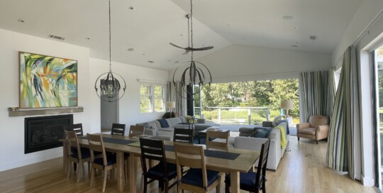
Kraig Meyer2024-02-08T16:49:38-08:00We modernized this 1980s rancher, building a great room with walls of windows opening up to the Mayacamas Mountains. The owners didn’t miss the warren of spaces that comprised the kitchen, dining and an awkwardly located bathroom. The expansive openings with sliding and pivoting doors replaced two small windows to truly bring the outdoors in. In the kitchen, a 10 foot island makes for perfect entertaining and ample space for guest, food and wine. The guests love the bathrooms, all modernized with floating vanities, dramatic tiles, and modern fixtures. The public and private areas of the house transition seamless through decks and stairs to the pool and hot tub area. This is wine country living at its best!
Midtown Mid-Mod
Kraig Meyer2024-02-08T16:49:09-08:00My clients in Midtown Terrace, a time-capsule of mid-century modern homes, were ready to jettison their 80s bohemian kitchen and cheaply remodeled bathroom for something more in keeping with the 50s vibe of the neighborhood. More functional space that would be contemporary but still have a nod to the past was the call to order. The challenge was that there just wasn’t a lot of room with which to work and no room to expand. The strategic elimination of a linen closet and closing of a door between the bedrooms and kitchen gave up just enough room to create a perfect work triangle. Shallow cabinetry on one wall allowed for all the storage they needed and still provide lots of room for meal preparation. Finishes included custom cabinetry, #Caesarstone counters, and picket-fence shaped tiles from #Sonomatilemakers gave it that mid-mod feel. The bathroom, remodeled in place, was an exercise in restraint. A rift-cut oak vanity and a linen/medicine cabinet tucked in a deep wall provided new storage and oversized hexagon tile offered a visual punch that didn’t overwhelm. Finally, a custom shelving system in a pass through at the top of the stairs finished the space. A contemporary installation in the historic-style of the home added a fun and interesting architectural feature. Photography Credit: Clay Seibert
Mill Valley Makeover
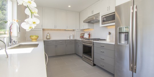
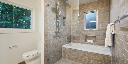
admin2024-02-08T16:48:06-08:00This 3000 sq. ft. custom built home unfortunately retained a little too much of its 1983 charm. My clients knew that they had to completely gut the master bath (see the sunken tub here) and give the kitchen, with its solid bones, a full update. I proposed reconfiguring the entire bath and created a bathing and shower area with natural stone concept porcelain tile to continue with an organic feel. A new custom vanity in a deep, rich cherry warms the space, and all the oak trim was banished. The windows, heights now aligned for architectural integrity, still let in loads of light and have views deep into the surrounding forest. In the kitchen, to meet my client’s budget, we painted the cabinetry to contrast with the new, custom Spanish Moss colored backsplash and compliment the valley views. A crisp white quartz counter is a vast improvement from original the apple red tile counter. And the room is now grounded in the same wood floors found throughout the home. Makeovers like this are always satisfying to work on, and this one, particularly the master bath, is a real stand out for me.

