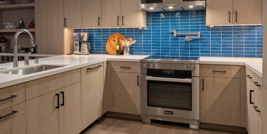
San Francisco built a new ballpark for the Giants in South Beach in 2000 and the area quickly transitioned from abandoned warehouses into a vibrant urban destination. Developers built new condominiums quickly to take advantage of the popular neighborhood amenities. While my clients loved the nicely scaled rooms and overall layout of their condo from [...]
Sonoma Entertaining Kitchen
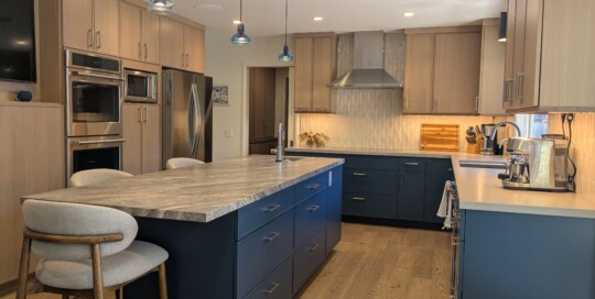
Kraig Meyer2025-08-13T11:53:51-07:00My clients were ready to part with the wood-burning stove and oversized hearth that dominated the kitchen in their mid-1960s rancher. While the stove was on trend at the time the home was built, it made the rest of the kitchen feel cramped and limited. They envisioned a space that would seamlessly support both indoor [...]
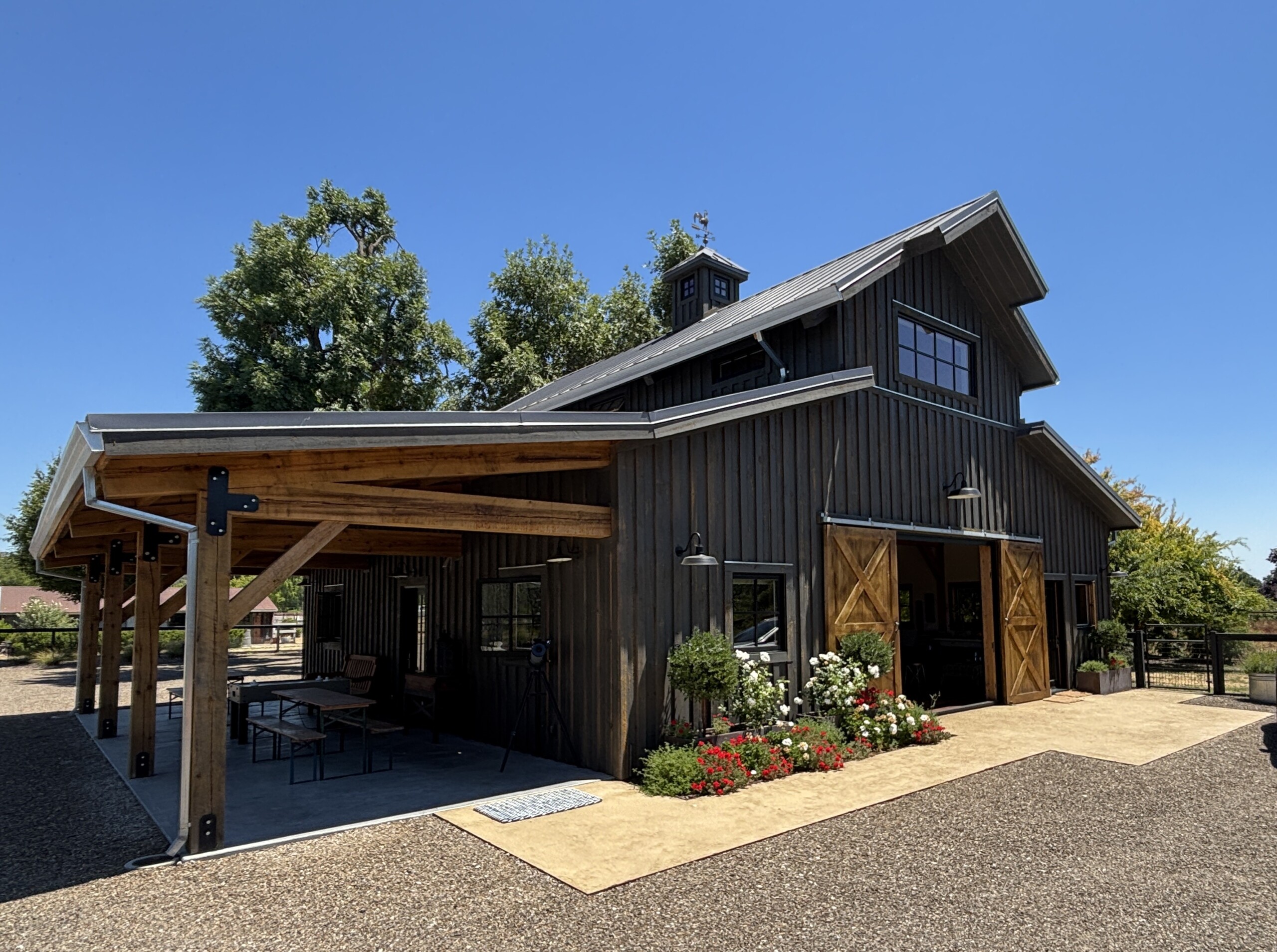
Rural Compound for Celebrations
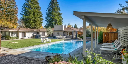
Kraig Meyer2025-08-04T16:47:14-07:00My client approached me to talk about a gorgeous property in rural California wine country. In addition to a farmhouse-style primary residence, the estate boasted acres of land nestled with olive groves, vineyards, farm animals, and pools. She envisioned renovating an existing structure to serve as the base for future family weddings and a haven [...]
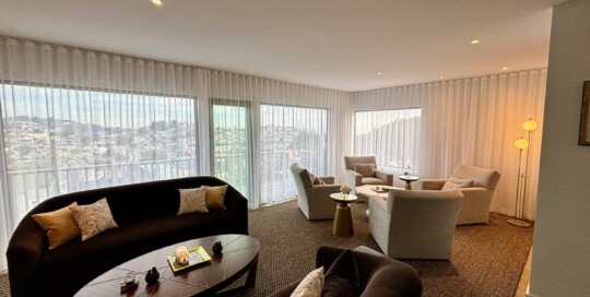
Glamor in Noe Valley
Kraig Meyer2025-02-10T16:14:49-08:00While the earliest developers built working class homes in Noe Valley for first generation immigrants, starting in the 1970's professionals flocked there due to its gorgeous views and proximity to both San Francisco and the peninsula. This hillside house was ready to expand from modest roots into a luxury home for a recently retired homeowner. [...]
Sonoma Valley Escape
Kraig Meyer2024-02-08T16:49:45-08:00A couple whose home I remodeled in San Francisco in the 2010s purchased this property in Sonoma during the pandemic. Located in Sonoma Valley, this property had all of the good bones of a wine country escape, including fantastic cocooning spaces, a large yard, great indoor-outdoor flow, and mature redwood trees providing privacy from the adjacent neighbors. The catch? Spending time there felt like a trip to grandmother’s house as the home was a bit shabby and the yard was dated with fences cutting it up into small period vignettes. We successfully turned the property into an escape in which anyone would enjoy an extended staycation (pandemic or not!) with a private hot tub, pool, fire pit, and lawn large enough for corn hole and croquet. We removed some of the fences and built custom shades to define separate spaces while maintaining an overall open feeling. In the hot tub area, we incorporated a Manos Made firepit, perfect for a cool evening nightcap. The outdoor dining area near the house has hosted both children’s birthdays and large adult dinner parties and the shaded chaise lounges by the pool have been enjoyed by the clients reading a book out of the summer sun. Even post-pandemic, these multiple spaces perfectly accommodate the clients needs, be it entertaining large groups or social distancing by choice. Project completed in close collaboration with Latker Design Solutions.
Kenwood Kitchen
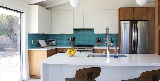
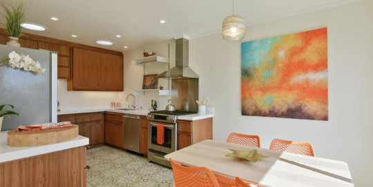
Kraig Meyer2024-02-08T16:50:15-08:00Most Californians with a passing interest in architecture are familiar with the work of Joseph Eichler, who built over 10,000 mid-century modern tract homes in California. So popular was his style that he inspired a subgenre known as “Likelers,” homes with the look and feel of an Eichler that were built by someone else. This “Likeler” home in Kenwood had many of the desirable features of that era: large walls of glass, an indoor-outdoor floorplan, and wood paneling. The clients’ wanted to keep the original character while bringing in the conveniences of a modern home. We modified the floorplan to open up the kitchen to indoor and outdoor entertaining areas with a see-through bar service area as a focal point and installed new kitchen cabinetry with a natural walnut finish as a nod to the paneling common in many original Eichlers. To keep the house grounded in a playful mid-mod style, pill shaped tiles from Sonoma Tilemakers in a bright teal color were used for the kitchen backsplash. Lastly, the floor of the entire home was redone with beautiful, large-format terrazzo tiles and the fireplace was reclad in a deco relief tile. The resulting space is perfect for this couple that loves to cook and entertain.
Post-Postmodern
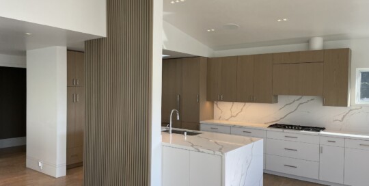
Kraig Meyer2024-02-08T16:50:05-08:00This property started its life in the early 1960s as did most homes in Midtown Terrace: a two story living space inspired by the Midcentury Modern movement with simplicity and clean lines. The 1980s brought a remodel that layered on a Post-Modern aesthetic, with curving walls, contrasting shapes, and bold colors highlighting classical architectural forms. The clients wanted to modernize the living space while downplaying the post-modern elements. The challenge? How to bring the home up to the standards of the present day without the cost of extensive exterior construction. The interior spaces of the house received a contemporary makeover. A beautiful architectural feature wall, grounded in a playful 1950s sensibility, provides separation between the kitchen and living room while maintaining an open floorplan. Skylights and windows were maintained and expanded, forging a connection between the interior and exterior spaces. A muted color palate downplays the curving front wall of the primary suite while decorative columns and tray ceiling from the Po-Mo remodel were removed. The bathrooms were completely rebuilt resulting in a contemporary yet timeless aesthetic.
Sonoma Ranch Update
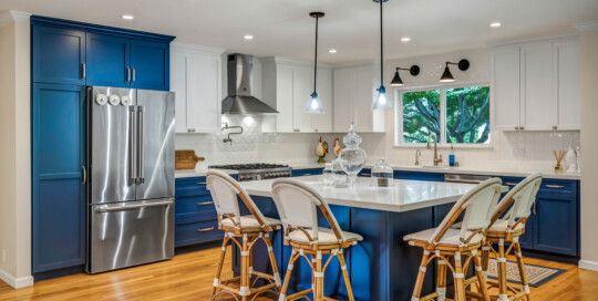
admin2024-02-08T16:49:16-08:00An outdated ranch-style home on the east side of Sonoma had a kitchen that was dark, cramped, and cut off from the rest of the house. My clients wanted to open up the walls and have a kitchen fit for entertaining friends and — even more importantly — their grandsons who live nearby. The melamine cabinets from the 80s were the first thing to go so the walls between the kitchen, dining room and living room could be opened up to their full widths. The bright blue and white color palette, a subtle trellis relief pattern on the backsplash tile, and timeless cabinet hardware and lighting tie the space together, that is now an integral part of the living area. In addition, an awkward transition from the living area, garage, and rear yard and pool was reconfigured, providing not only better light and flow, but a new powder room and laundry too. My clients are very happy now to have their grandsons over as much as they want.
Vista del Mar Renovation
Kraig Meyer2024-02-08T16:48:24-08:00In the Outer Richmond, new homeowners had a charming home blocks from the ocean, but with all the original 1942 finishes in place. They had a clear vision for the aesthetic they wanted, and with some minor tweaks to the layout and custom built cabinets, the strategic placement of Vitsœ “606 Universal Shelving System” units, and solar-tube skylights to bring in more light at the back of the kitchen the transformation was complete. In the bathroom we removed the cramped shower and moved the vanity to open the room. Crisp white picket tiles from Sonoma Tilemakers and green penny rounds on the floor and accented in the niche, provide the background to what is now a function and timeless bathroom. Now these are spaces they can enjoy for years to come. Staging by Patricia Theel Design and original artwork by Katja Francesca Tapia.
Sunset Kitchen
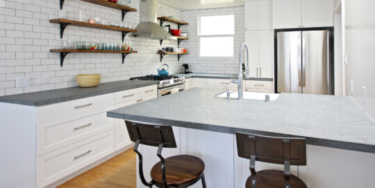
admin2024-02-08T16:49:04-08:00Before you get your new kitchen, you probably have to live with something not-so-functional for a while. My clients lived without a dishwasher, cabinets that didn’t close, and a vintage stove that didn’t really work. When they were ready to upgrade their kitchen, we took it down to the studs. Opening the kitchen to the dining room was the first step, followed by a super-functional layout. Pietra grigio marble counters contrast with the custom white cabinetry and a mix of rustic touches and metals finish the space. The full wall of hand-cut and hand-glazed subway tile provides a dramatic backdrop without overwhelming. The clients are thrilled to be back in the bright new space with room for entertaining. Next up, the original 1941 bathroom…

