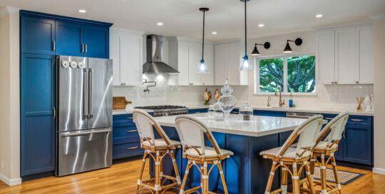
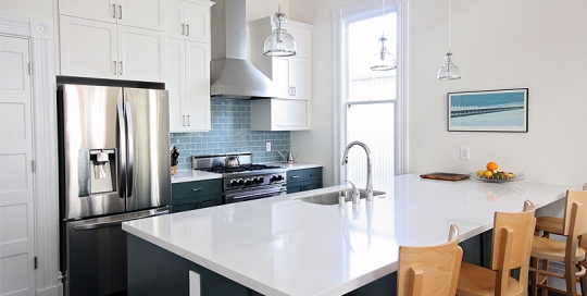
An outdated ranch-style home on the east side of Sonoma had a kitchen that was dark, cramped, and cut off from the rest of the house. My clients wanted to open up the walls and have a kitchen fit for entertaining friends and — even more importantly — their grandsons who live nearby. The melamine cabinets from the 80s were the first thing to go so the walls between the kitchen, dining room and living room could be opened up to their full widths. The bright blue and white color palette, a subtle trellis relief pattern on the backsplash tile, and timeless cabinet hardware and lighting tie the space together, that is now an integral part of the living area. In addition, an awkward transition from the living area, garage, and rear yard and pool was reconfigured, providing not only better light and flow, but a new powder room and laundry too. My clients are very happy now to have their grandsons over as much as they want.
The 1950s Modernized
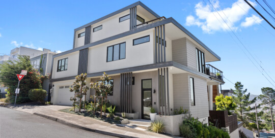
admin2024-06-26T10:41:57-07:00I completely reimagined this 1950s-era property in Glen Park in a down-to-the-studs remodel; Custom finishes with one-of-kind designs and subtle nods to the home’s mid-century roots are throughout. The main level is a contemporary, open floor plan with kitchen, dining, living and an intimate library seating area center. A dramatic modern stair leads to the upper-level primary bedroom. This special property deserved a wow factor, and I was thrilled that the clients were willing to pull-out the stops for dramatic tile in the guest bath. The primary bath features a custom waterjet cut tile design on the floor that adds interest without overwhelming. There are custom cabinetry pieces throughout such as the family room cabinetry with storage and display space and clever sliding slats that reveal the television. I’m so excited to share the final product!
Wine Country Makeover
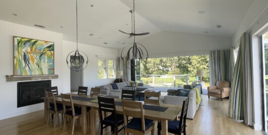
Kraig Meyer2024-02-08T16:49:38-08:00We modernized this 1980s rancher, building a great room with walls of windows opening up to the Mayacamas Mountains. The owners didn’t miss the warren of spaces that comprised the kitchen, dining and an awkwardly located bathroom. The expansive openings with sliding and pivoting doors replaced two small windows to truly bring the outdoors in. In the kitchen, a 10 foot island makes for perfect entertaining and ample space for guest, food and wine. The guests love the bathrooms, all modernized with floating vanities, dramatic tiles, and modern fixtures. The public and private areas of the house transition seamless through decks and stairs to the pool and hot tub area. This is wine country living at its best!
Mill Valley Makeover
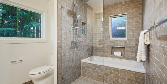
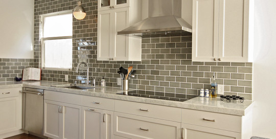
admin2024-02-08T16:48:06-08:00This 3000 sq. ft. custom built home unfortunately retained a little too much of its 1983 charm. My clients knew that they had to completely gut the master bath (see the sunken tub here) and give the kitchen, with its solid bones, a full update. I proposed reconfiguring the entire bath and created a bathing and shower area with natural stone concept porcelain tile to continue with an organic feel. A new custom vanity in a deep, rich cherry warms the space, and all the oak trim was banished. The windows, heights now aligned for architectural integrity, still let in loads of light and have views deep into the surrounding forest. In the kitchen, to meet my client’s budget, we painted the cabinetry to contrast with the new, custom Spanish Moss colored backsplash and compliment the valley views. A crisp white quartz counter is a vast improvement from original the apple red tile counter. And the room is now grounded in the same wood floors found throughout the home. Makeovers like this are always satisfying to work on, and this one, particularly the master bath, is a real stand out for me.
Forest Hill Knockout
admin2024-02-08T16:48:00-08:00What to do with a not-so-grand kitchen in a very grand home? I helped my clients do just that. After returning to San Francisco and an exhaustive search for a new home, my clients found a beautiful residence in Forest Hill. Unfortunately, the kitchen was in desperate need of an update. A poorly placed bathroom addition constrained the original kitchen and stopped the flow to the rest of the house and a door to the dining room was only useful if you still had a butler. To open the kitchen footprint and provide access to the living room with its expansive Golden Gate Bridge views, the first step was to move the powder room. A pocket door here and a shifted opening there allows my clients to interact with guests and take in the views. With the new plan in place, a gorgeous “Princess White” quartzite stone slab set the palette for the reconfigured kitchen; handcrafted tiles added depth; and custom cabinetry was designed to house the top-of-the-line Thermador appliances the clients had chosen. A Thomas O’Brien pendant added sparkle and a perfectly-sized crystal chandelier crowned the custom banquet and table from Big Daddy’s antiques. After entertaining family for the first time, my clients were excited to be showing off their new space and told me they are now cherishing new memories, something I was thrilled to hear and to have helped create.
Sonoma Retreat
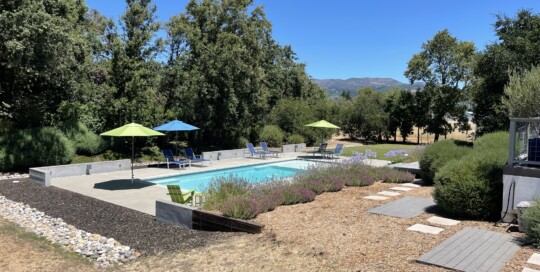
admin2024-02-08T12:24:20-08:00The owners saw endless opportunities for this empty lot, with mountain views and plenty of room for a pool. We strategically placed the pool to accommodate future expansion of the adjacent home while maximizing views. Low seating walls provide an architectural frame, transitioning to native vegetation and a privacy berm. Our design included a lawn adjacent to the pool deck that’s the perfect size for croquet, volleyball and badminton. Cheerfully bright custom daybeds sit under a shade structure, built on a repurposed concrete pad. As a treat for the winter months, a hot tub deck was built adjacent to the bedroom wing.
Eureka Valley Victorian
admin2024-02-08T16:47:25-08:00Anyone who knows the San Francisco real estate market knows that you need to jump when the right opportunity comes along. And jump my clients did, at a spacious, light-filled flat in a prime Castro Village location. The only drawback? It was going to require a complete gut, including the removal of walls added during a previous, unfortunate remodel. With almost 1400 square feet of raw space to work with, the sky can be the limit. The reality, of course, is tempered by budget. By strategically thinking about what could be saved, we were able to limit the structural work required with such a large reconfiguration, and by keeping those costs in check were able to get the amenities and finishes the clients desired including three bedrooms, an en suite master bath, and a large, unobstructed living space that’s perfect for entertaining. Built in 1886, we let the building set the tone for the design elements, maintaining Victorian details while providing all of the upgrades that are expected in a modern home. In the kitchen, traditionally detailed custom cabinetry in strong colors, boldly textured tile, and unexpected lighting fixtures are balanced with understated finishes to create spaces perfectly suited to the clients’ eclectic tastes and honoring the building’s history. From the architectural design to construction, the process went flawlessly. You’d never know that this space required the work that went into it, and surely well worth it.
Cole Valley Condominium
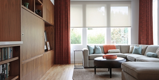
admin2024-02-08T16:48:16-08:00This project started as a typical 1930’s San Francisco single-family residence, with two small bedrooms, original canary yellow tile in the bathroom, and a 1970s era kitchen that had seen better days. Now in its place stands a handsome two-unit building comprised of more than 5000 square feet. Color choices on this project ensured that the space was warm and inviting while still being sleek and contemporary. Custom walnut cabinetry is installed throughout the home, complemented in the living room with teal and orange accents in pillows and ripplefold drapery. In the master suite, a cooler palette of blues and beiges with silver accents is reflected in the custom headboard and artwork. The kitchen includes everything you’d expect and more: a high-BTU gas cooktop, double ovens, an extra prep sink, and a walk in pantry, which feels almost opulent by San Francisco standards.

